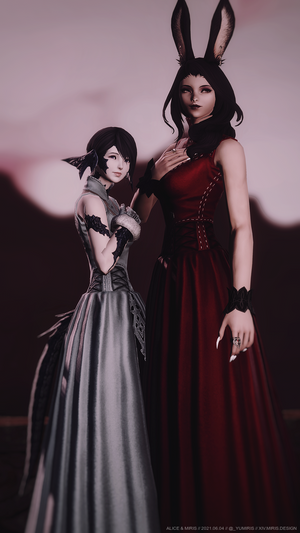
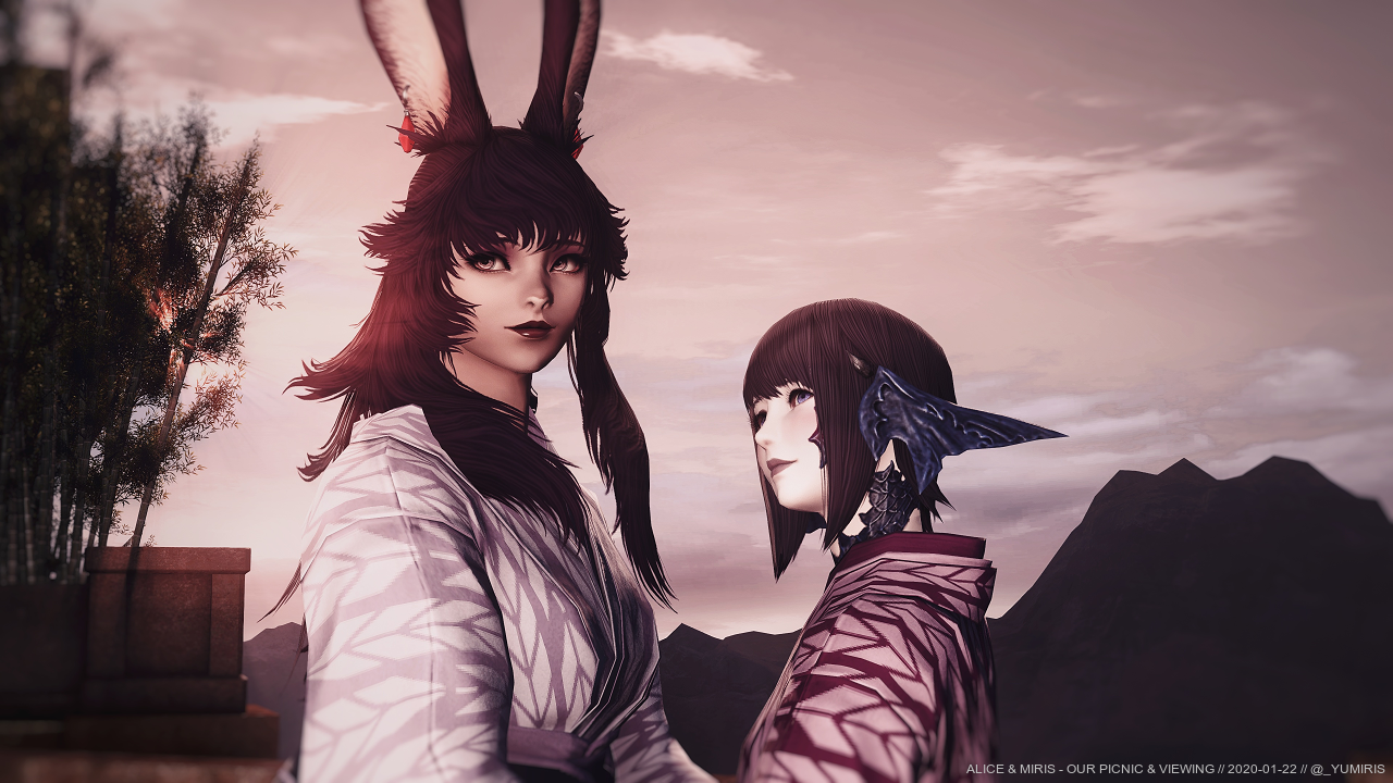
Introduction
Eorzea Photography hosts XIV photography competitions with a different topic each week. Its 8th competition focused on showcasing the eye, permitting for a splendid opportunity to capture my Viera's most iconic feature.
With constant revisions - each receiving indispensable feedback from dearest Alice - the final photograph ended up being the winning one. We are grateful to all of the people who have voted for our photograph!
Our 8th Eorzea Weekly event has come to an end! Our theme this week was to showcase the eyes. And our winner is... @_yumiris 🏆Kudos!
— Eorzea Photography - A Place of Learning (@EorzeaPhotos) February 29, 2020
Want to participate? Join our Discord to find out more information! https://t.co/XBuGL3XKc1#EorzeaPhotos #GPOSE #screenshot pic.twitter.com/szVYCiCOW5
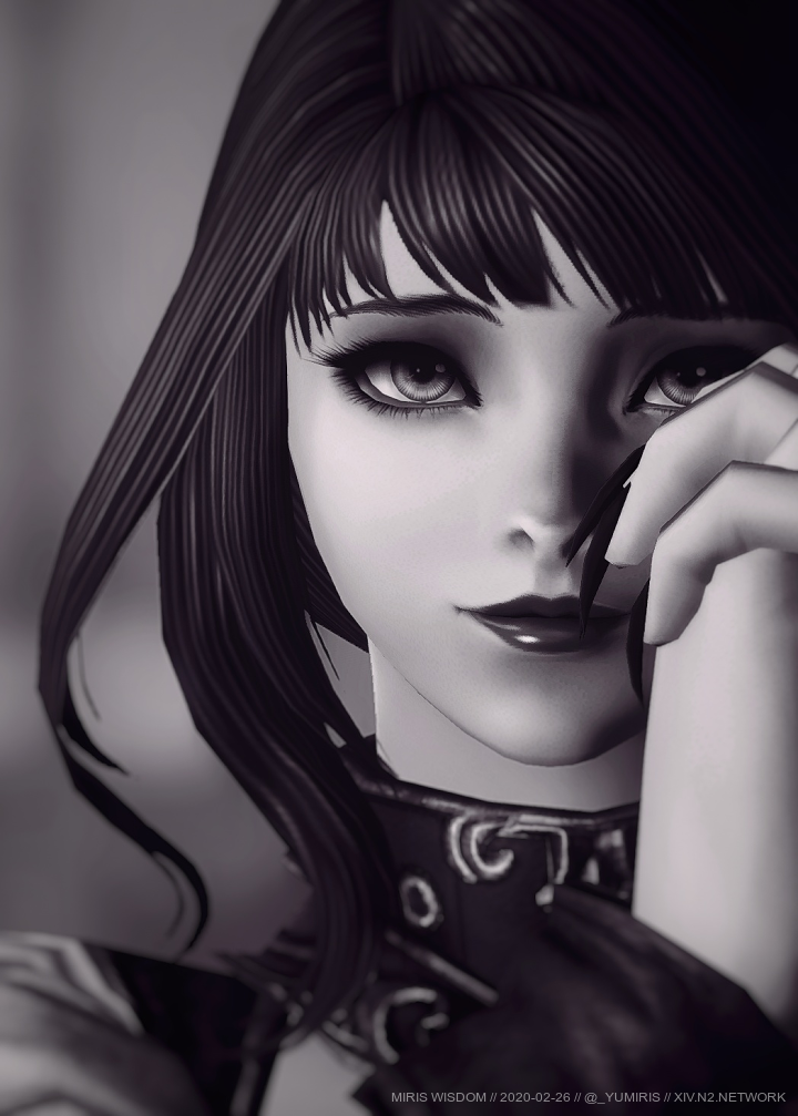
This post retells the process that brought this photograph to life, with emphasis on the technical details that went into the final revision. In reality, such perfectionism was probably not necessary; however, it's a desire of mine (and dearest Alice's) to strive for immaculate results.
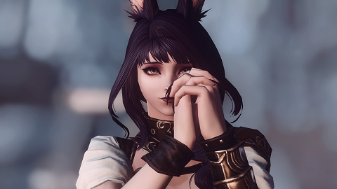
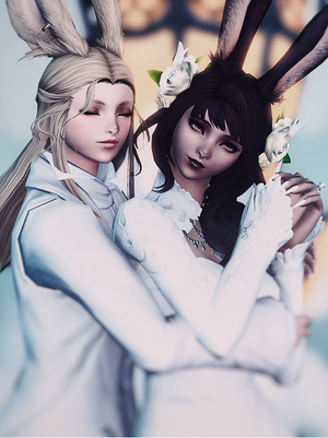
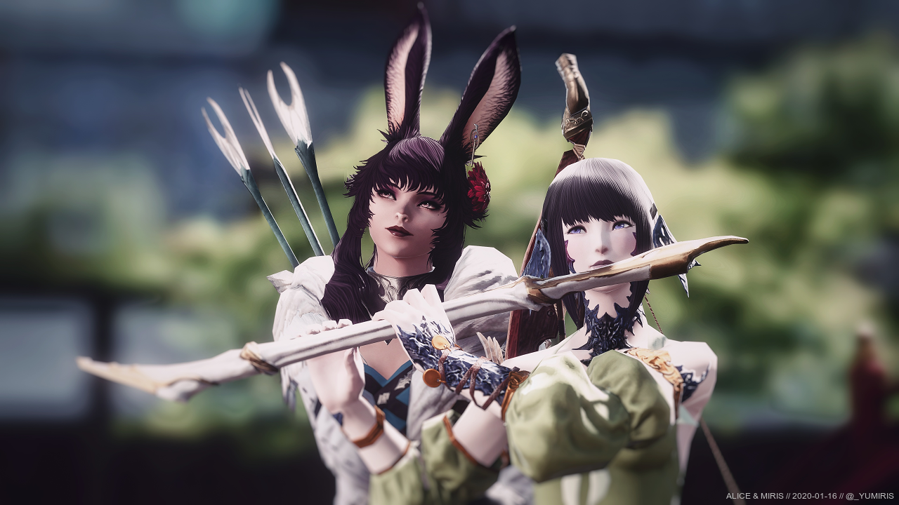
The First Attempt
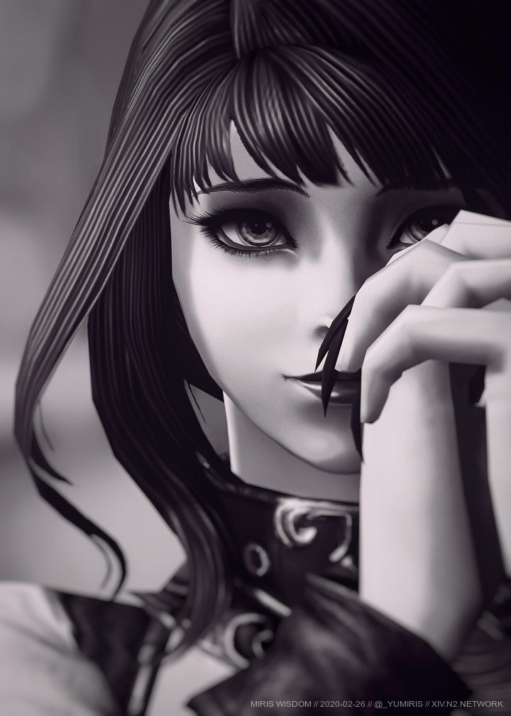
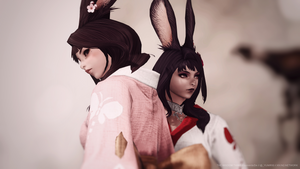
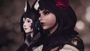
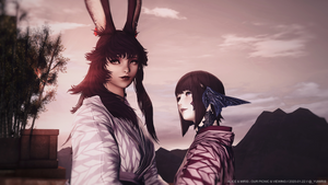
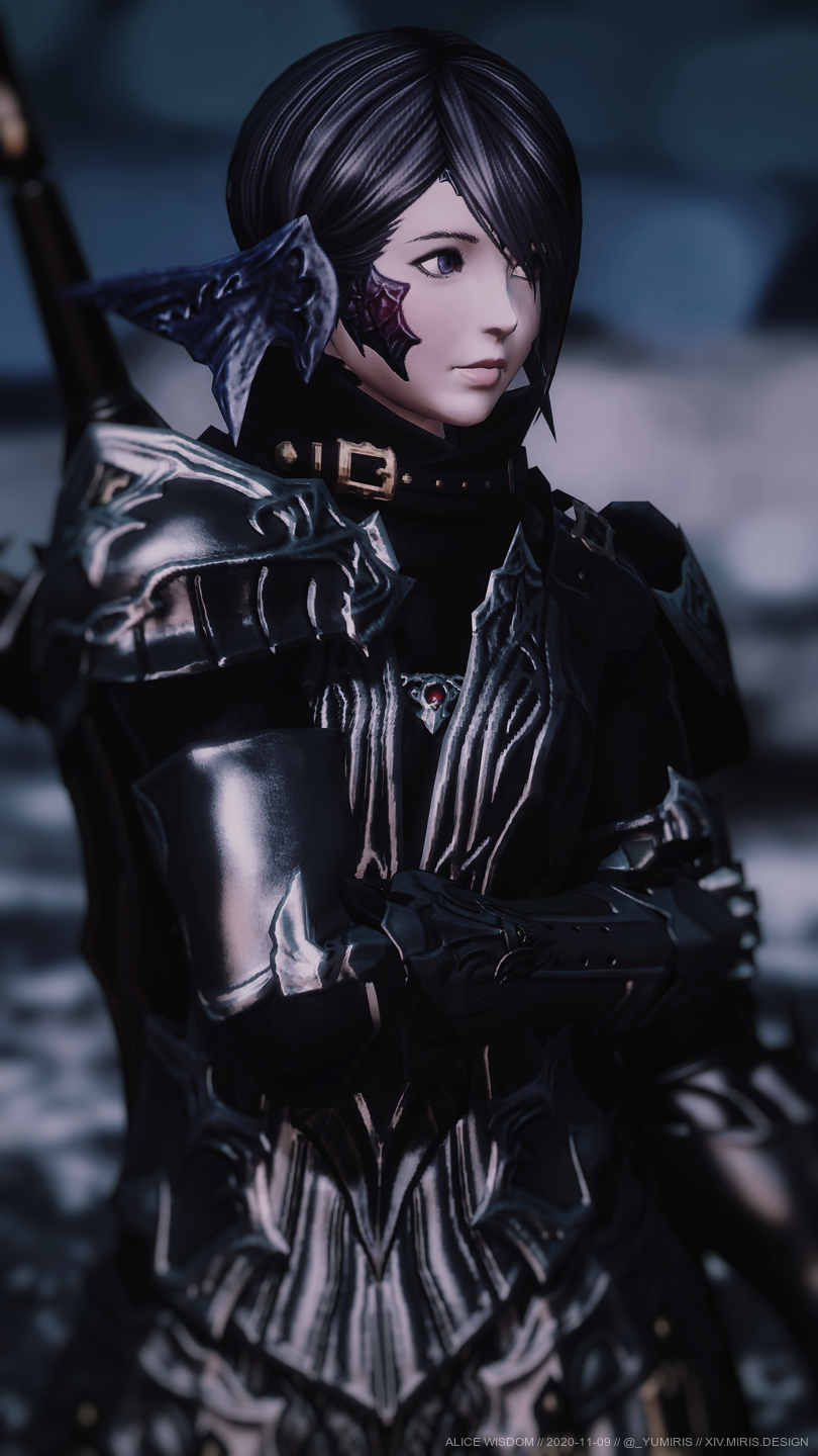
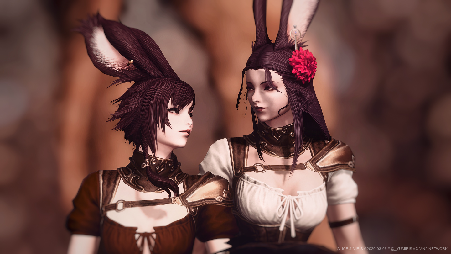
The final entry (shown above) is radically different from the first photograph:
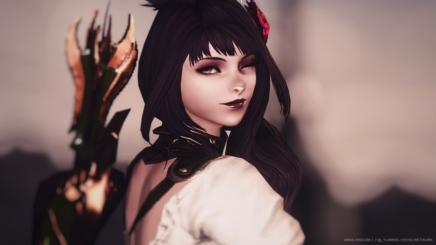
With this picture, I aimed to rely on my Viera's eye colour and shadow to make them stand out. They contrast heavily with her lighter skin tone, thereby permitting them to be the spotlight of the photograph... or so I thought. Indeed, I've had my doubts regarding the strength of this potential entry. A part of me felt like the eyes don't stand out enough, and with input from Alice, my suspicions were confirmed.
There are two principal problems with the photograph...
The Visual Problem
The first problem is purely visual. In essence, there are a lot of elements that would distract the viewer, and thus undermine the presence of the eyes. The bow on her back, the light top, the flower on her head, and of course, the lips - all of these stand out quite heavily in their own regard, thereby making it difficult to focus solely on the eyes.
Worse, their presence reduces the chances of the eyes being the first element the viewer looks at. My endeavour was to ensure - at least as much as possible - that the eyes are the first component the viewer glances at.
These observations were based a lot on feedback from Alice, who then proceeded to give several examples and paragraphs on what effective eye photography is. I incorporated her advice into the subsequent photographs which are described later in this post.
The Photographic Problem
The second problem is much more subtle, and a tad more subjective. In a nutshell, the eyes aren't "photographically" highlighted in the image. That is, I gambled on the subject's properties, rather than on photographic techniques.
To elaborate, my attempt at making her eyes shine relied on the properties of said eyes, i.e. their shape, colour, eyeshadow, etc., rather than photographic techniques such as prominent focusing, centring and lighting.
With the above problems in mind, it was clear that I needed to take a wildly different photograph which incorporates a completely different philosophy and attitude...
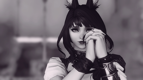
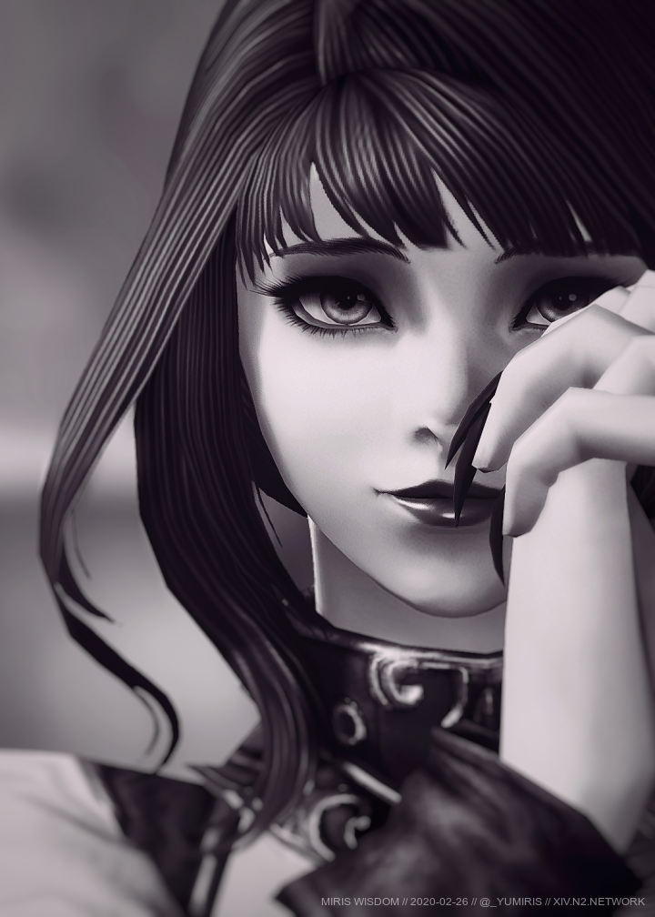
The Second Attempt
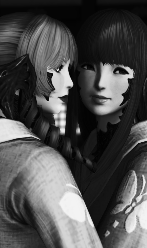
The second photograph aimed to solve the aforementioned problems:

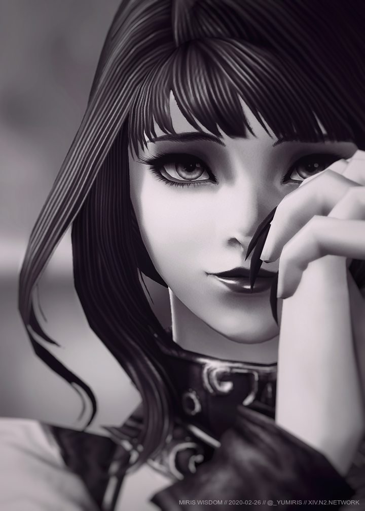
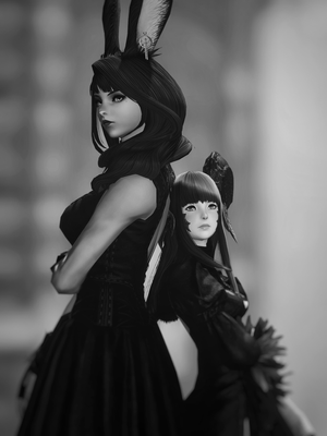
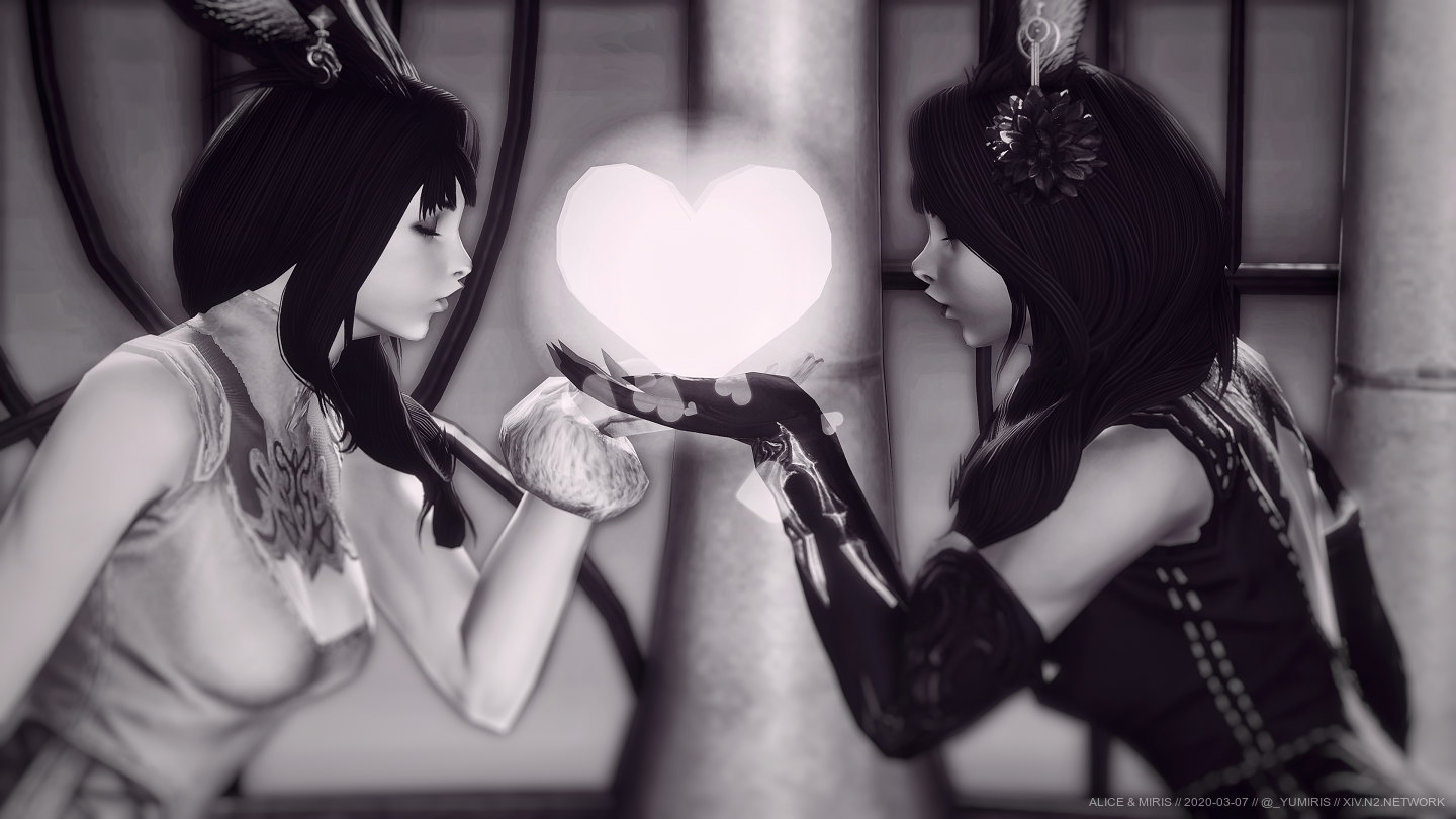
It solved the first one simply by being a close-up portrait of my Viera's face, rather than a landscape image capturing her upper body and face. This significantly eliminated potential distractions such as the flower and the bow. Of course, the lips would still be present, and I've gambled a bit by including her nails in the picture, too.
Speaking of gambling, I relied a bit on it to sole the second problem. Instead of using the subject's contrasting colours to make the eyes stand out, I decided to make the photograph a greyscale one, and rely purely on lighting and composition to focus on her dark eyes.
The Composition
For the composition, as mentioned in the previous paragraphs, I wanted a close-up portrait this time with one of her eyes being in the centre of the photograph (like in the first image).
I also wanted to break away from my Viera's usual flirtatious, confident impression and instead show a more innocent, graceful side of her. To accomplish that, I timed the /prettyplease emote in the middle of its animation, which resulted in my Viera looking like she's holding her hands near her face.
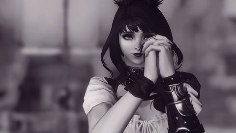
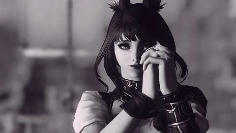
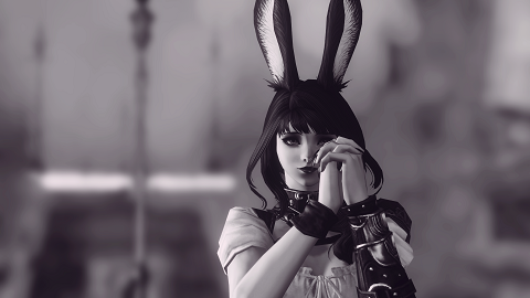
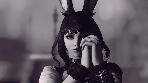
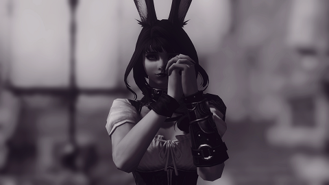
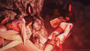
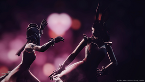
This pose also allowed the lips to be obscured, and the other eye was made a little more mysterious. It took a few revisions, because all it takes is a little offset in the position and delay to change the entire impression of the subject:
The image on the left relies on the rule of thirds on both the horizontal and vertical axis for the placement of the eye. The consequence is that the hands are dominating the image too much.
The image on the right, amusingly, suffers from the opposite consequence: the hands are undermined in the photograph. I wanted the hands to immediately be recognised as hands. The image on the right, in my eyes (heh), posed the risk of not being recognisable as hands at the first glance. Of course, the lips being easily visible wasn't good, either.
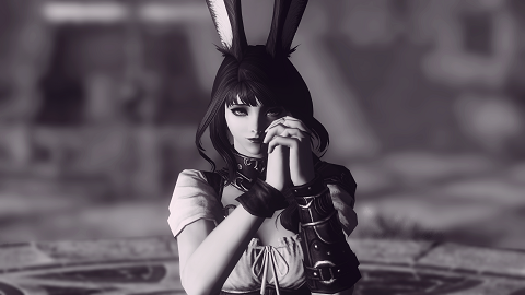
The image in the centre balances out between having the eye vertically in the centre of the photograph, whilst still following the rule of thirds, capturing a hint of my Viera's lips, and permitting the hands to be recognised as hands at the first glance. The nails are also a bit more prominent, and although that comes with the risk of distracting from the eye, they do serve as a contrast to the innocent face.
The Lighting
The lighting was arguably harder than the composition. It ended up haunting me the most, though this will be discussed in several moments.
Essentially, I wanted a balance again in terms of lighting. I wanted to make sure that the lighting permits for highlights and shadows that make the eye stand out. This means the eye's darkness and the skin's lightness being emphasised upon. Too little contrast, and the focus is diminished.
Artificial lighting wouldn't have accomplished the the subtle gradient on her cheek, and the faint shadow on the edge of her cheek, and of course, the shadow on her eyes. Indeed, the lighting in the photograph is natural, with just a tiny bit of artificial one for subtle corrections.
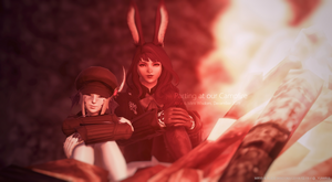
The lighting is the product of being at the Last Vigil, during sunset, whilst the weather was fair skies. Location, time of day and weather can be incredibly paramount to achieve just the right lighting on a subject.
The Resubmission
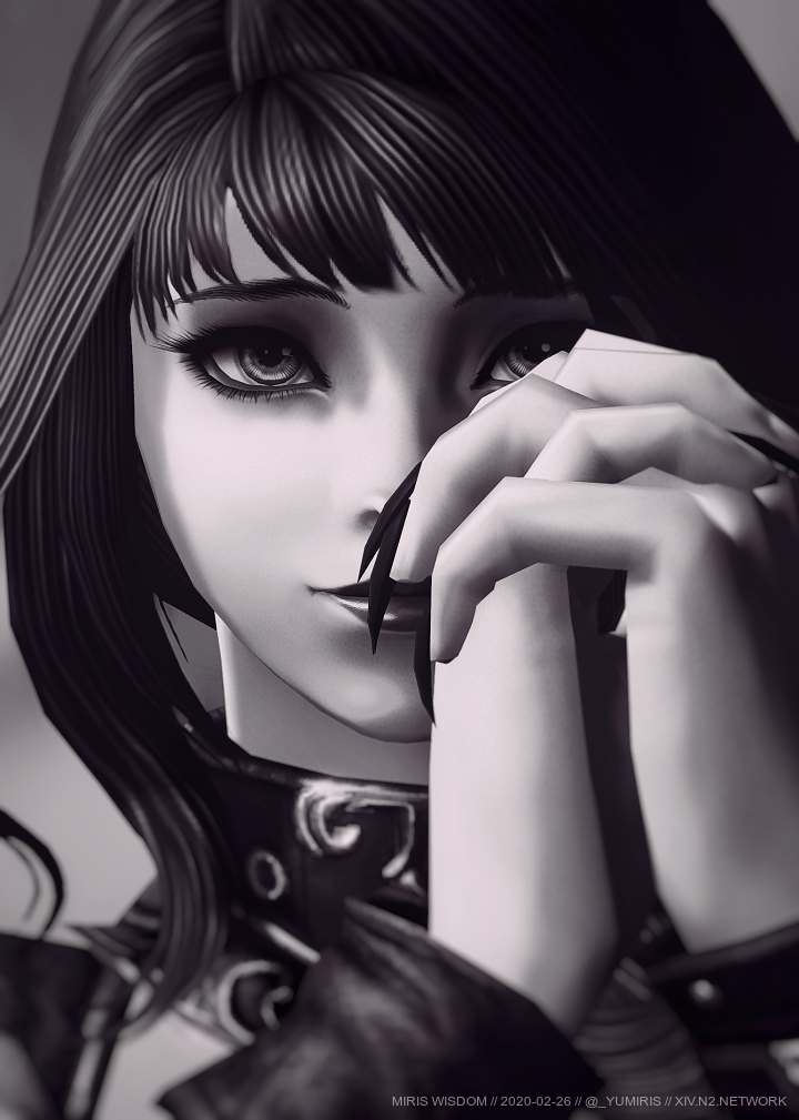
Pleased with the results - as was Alice - I submitted the photograph. Happy days, until I was bombed with the prompt to resubmit it. By sheer negligence, I forgot that I was using a mod which emphasises the irises' contrast. Indeed, the difference is enough to be recognisable.
I had no choice but to recreate the photograph almost - if not exactly - as the submission, but with the eye mod being removed. Suffice to say, Alice and I's perfectionism and passion resulted in a two-hour long process of constantly sending her revisions for feedback. It did become pretty daunting, because even though each revision was close enough to the submission, it lacked the magic in the lighting:
The revisions either had too little lighting, or too much contrast, or too little contrast. It just wasn't the same. Alice saw it, and I knew it. The moment she's said "You already know the answer" when I asked her if this will do, I've truly realised both her intuition of my perfectionism, and the passion she has as well for my photograph, which of course ended up being our photograph.
After seventy or so revisions (oh boy), it was truly getting nowhere. I've grown tired at that point and then decided to sleep, ready to give up.
... Until I woke up again, went online, and luckily captured the photograph with the exact lighting. That restored the magic, and resulted in quite the deepest sigh of relief. Indeed, the lighting techniques I've mentioned earlier were a retrospective realisation. I initially went by my intuition, without realising that it was the weather and time which caused it all.
To add salt (and lemon) to the wound, Alice even pondered if the time & weather influenced the lighting. She turned out to be right, as always.
Not only the recreated photograph captured the original's magic to a very high degree, but it also improved upon it. The improvement is primarily in the placement of the nails: they're exactly in the middle of the lips.
The left is the original submission, and the right is its approved recreation:

And here we are - the tale of probably my most passionate photograph so far. In the grand scheme of things, the effort was probably not a necessity. Any of the discarded revisions shown above would've likely sufficed; however, Alice and I's passion aims to push our boundaries to their extremes.
I truly commend her patience and diligence regarding her feedback and suggestions, and I respect the competition's purism regarding its submissions. In retrospect, recreating the photograph was definitely an excellent challenge which was worth the time. It served as a testament of our passion and teamwork.
And of course, a thank you to all who voted for our photograph. We truly appreciate it!


